How To Make Interesting Video Thumbnails Like a Boss
Contents
So you have produced a fantastic video for your brand.
You can’t wait to upload it and share it with the world.
Wait just a minute.
Do you have a good video thumbnail yet?
Selecting a thumbnail that Youtube provides might seem like the easy way out. But DO NOT, and I repeat, DO NOT do that.
According to YouTube, 90% of the most popular videos have custom thumbnails.
Why is that?
Before they watch your video, your audience will see the thumbnail. And, a good thumbnail could determine whether your video will be watched or ignored.
Thumbnails are mini-previews of your video and can be anything from a shot from your video to emojis and text on a colorful background.
In this article, we will be talking about how you can create unique, eye-catching thumbnails that are sure to grab the audience’s attention and get them clicking.
Let’s go forth, shall we?
How to create good video thumbnails
People say, “don’t judge a book by its cover".
It's a valid statement, but who are we kidding. They also say that the first impression is the best impression.
And when it comes to your video, your thumbnail will be the one making the first impression.
Since thumbnails are so crucial towards the success of your videos, let us look at how you can make one that will undoubtedly grab the attention of your viewers.
1. Choose a high-quality image

Nobody will look at a blurry video thumbnail and think “Aha! This looks interesting, I better click on the play button”.
Yeah, a very unlikely scenario.
So, it's crucial that you only upload thumbnails of high quality. Put your photo editing skills to use. Improve the contrast, sharpen the image.
Make sure that it's visible from the moon (just kidding, of course).
A good quality video thumbnail will encourage viewers to take an interest in your video and will also let them know that you are serious about what you are doing.
2. Add the important keywords

Your video thumbnails can and MUST contain a few keywords that are relevant to your video. This doesn’t imply that you should copy your whole title and superimpose it on your thumbnail.
Shorten it out, choose only the vital keywords, or even bring in a few words that are not part of your title.
Your video thumbnails could even contain an eye-catching sentence or phrase that will be covered in the video but does not come in the title.
When you do add keywords, make sure that it doesn’t cover more than 50% of your video thumbnail. Ain’t nobody got time to sit and read stuff when they could be watching the video.
3. Ensure good contrast

Take for example the video thumbnails of Neil Patel. He uses an orange background and fills it with relevant imagery. With 446K subscribers in total, this could be a good tip to borrow from Neil.
Another thing to keep in mind while adding keywords to your video thumbnails is to make sure that your text contrasts with your image.
Yeah, don’t try and blend things together to look artsier.
These high contrast keywords will pop out to attract your viewer's eye. It will help the viewers decide whether they should be watching the video.
Using contrasting colors is also a good idea if you choose the colors wisely.
You’ll obviously have to give it a few tries and see if this works for you. After all, orange isn’t for everyone, you know?
4. Include two dissimilar images

You might be about to upload a comparison video. It could be the comparison of different products, different situations or something at various price points, etc.
The best way to pique your audiences’ interests when uploading such a video is by adding two highly contrasting images, without telling which is which.
The viewers will be immediately curious to know which product/situation is better.
You could even specify the differences in the thumbnail, but this will take the mystery out of it.
And you know everyone loves a good mystery.
5. Use faces for emotion

Adding human faces to your video thumbnail is one of the best ways to draw the audiences’ attention.
Use shots of the people FROM the video. You could take a few good closeup shots that match the feel of your video while you film it. By doing this, you will ensure that you have the perfect image with you and wouldn’t have to go searching for it in the video.
Having a face in the video will immediately make it a lot more relatable to the viewer and prompt them to start watching.
You could take your video thumbnails a step forward by using faces that convey strong emotions. This could be anything from surprise to disgust. Expressions are a sure-fire way to get the audience wondering what made these people feel this way.
One thing to keep in mind when including people’s faces is to always be honest and not show any expressions that have nothing to do with your video.
6. Don’t promise more than you can deliver
You might feel like exaggerating when it comes to what your video includes. But, mark our words, this is an extremely bad idea.
Nobody likes clickbait.
When your viewers discover that they won’t be getting what they came for, they won’t trust you anymore. In their minds, you will become a brand that is dishonest and cheats people.
Only give previews of the content from the video in the thumbnail. Don’t bring in additional substance that might deceive the viewer.
Always be honest.
7. Upload using the appropriate dimensions

People watch videos on a variety of devices. It could range from a small smartphone to an HD TV. So it's of vital importance that your thumbnail looks good no matter the size.
It's always better to upload in a bigger size and then scale it down instead of uploading at a smaller size and having reduced clarity on bigger screens.
Doing this will make sure that your audience will not be put off by those blurry thumbnails.
Video thumbnail specifications for better resolutions
Youtube Video Thumbnail Size
- Size: 1280 x 720 pixels
- Aspect ratio: 16:9
- Minimum width: 640 pixels
- Size: 2MB limit
- Formats supported: JPG, GIF, BMP, and PNG
Facebook video thumbnail size
- Size: 1200 x 675 pixels
- Aspect ratio: 16:9 or 1:1
- Text: Less than 20%
Instagram TV video thumbnail size
- Size: 1080 x 1680 pixels
- Size: 4MB limit
Twitter video thumbnail size
- Size: 640 pixels by 360 pixels
- Aspect ratio: 16:9 or 1:1
- Size: 5MB limit
8. Add the company logo

A great way to create an identity for your videos and make them memorable is by adding your company logo to the thumbnails.
Branding ensures that you create a distinguishable persona for your video. This helps viewers to know why they started watching you and what's unique about your videos.
However, do make sure that the logo doesn’t take center stage but seamlessly blends in with the image.
9. Be consistent

When it comes to making thumbnails, always create a pattern. Add similar colors, fonts, and keyword placement. Your viewers will instantly recognize this template when they see it later and associate it with your brand.
It creates a good impact on the viewer's mind by perceiving a unique value for you. Even use your brand colors if it seems like a good idea.
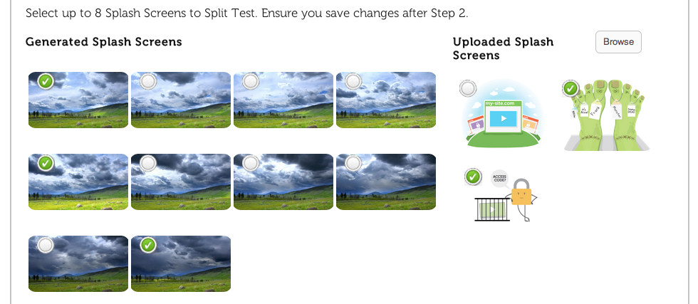
10. Carry out A/B split testing

It is always a good idea to find out what kind of thumbnails will perform best for you. Publish your videos with two different thumbnail formats and see which one receives better engagement.
You’ll then have a better understanding of how to create good thumbnails in your future videos.
Using Video Thumbnail Makers
If the whole process of making video thumbnails seems daunting to you, fret not. There are several video thumbnail maker softwares that can help you.
These will cut down your work and provide you multiple options to choose from. You can customize your thumbnail using various fonts, backgrounds, templates, icons, etc.
Given below is a list of the popular video thumbnail makers available online.
Here is the step-by-step guide to creating your own custom video thumbnail using the above-mentioned softwares.
Note: We are going to be using 'Canva' for this tutorial.
Step 1: Open Canva and select 'create a new design'. Choose the platform you're going to post your video on. This automatically ensures the correct aspect ratio.

Step 2: Choose the desired background for your video thumbnail. Make sure to match the color of your background to the theme of your video.

Step 3: Add an image, it can be a clip from your video or select one from Canva's wide range of stock photos.

Step 4: Choose your font style and input your desired text and make sure to include your target keyword.

Step 5: Download it according to the format you want. Mostly people prefer PNG files as clarity is not compromised even after compression.

And there you have it! You're now armed with all the tips and tricks to go make some awesome video thumbnails.
Any questions? Do reach out to us in the comments. Also, if our guide helped you make your first thumbnail, we'd love to see what you came up with!
.png)


